Research and visual style
Typefaces are not "the new thing", but with the evolution of computer graphics and the rise of digital foundries, their history is more and more forgotten.
I started by performing an analysis of some foundries' visual style, and I followed my desire to communicate passion, and to represent the heritage of early metal typefaces.
In order to succeed, I tried to understand the essential traits that have been representing typefaces since the beginning of the letterpress print era:
- font case (upper / lower)
- font weight (thinner, bolder)
- embossing due to the printing pressure
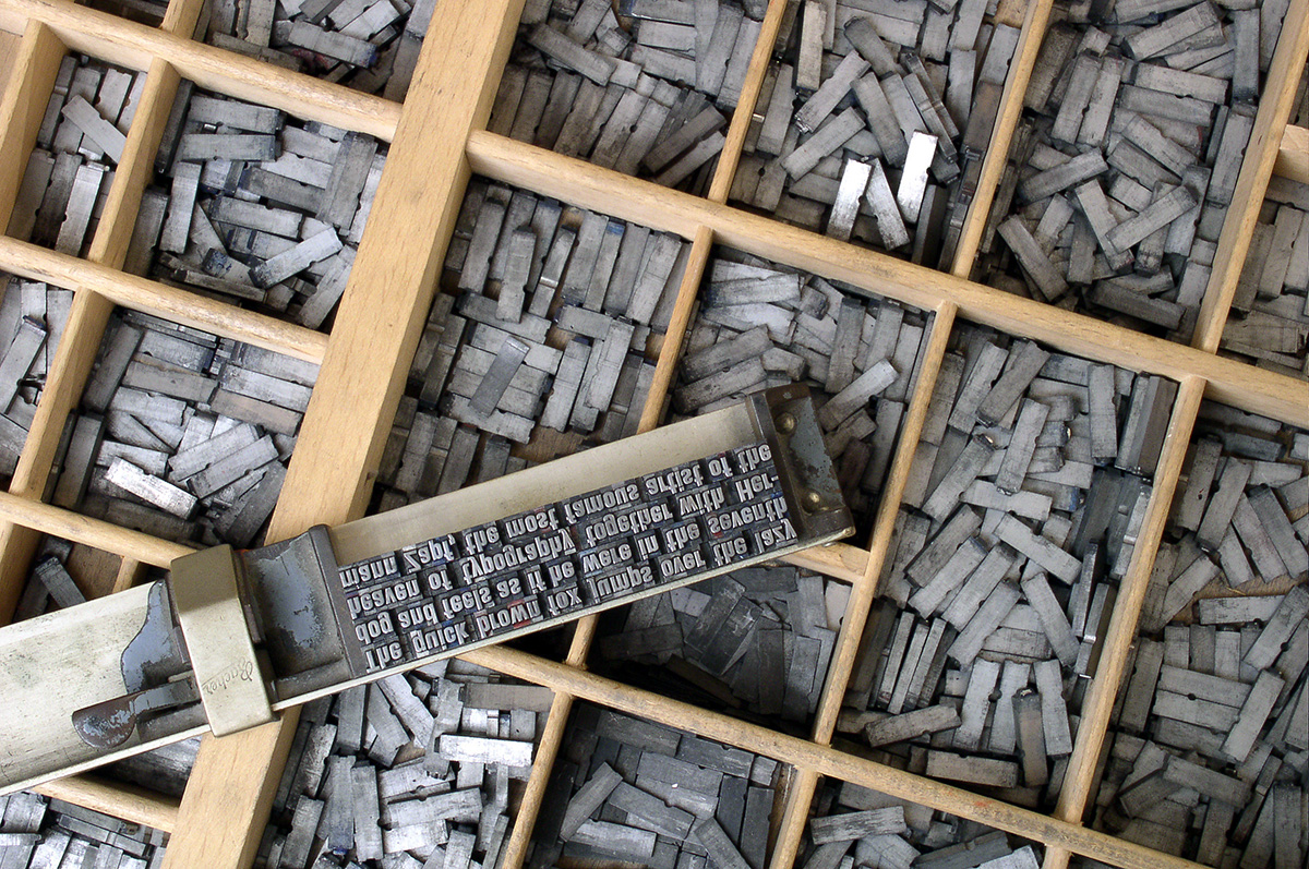
Image by Willi Heidelbach, found here and provided with CC BY 2.5 License
Logotype, "mood"
In my attempt to create something unique and vibrant, I understood that I wanted to represent all of them.
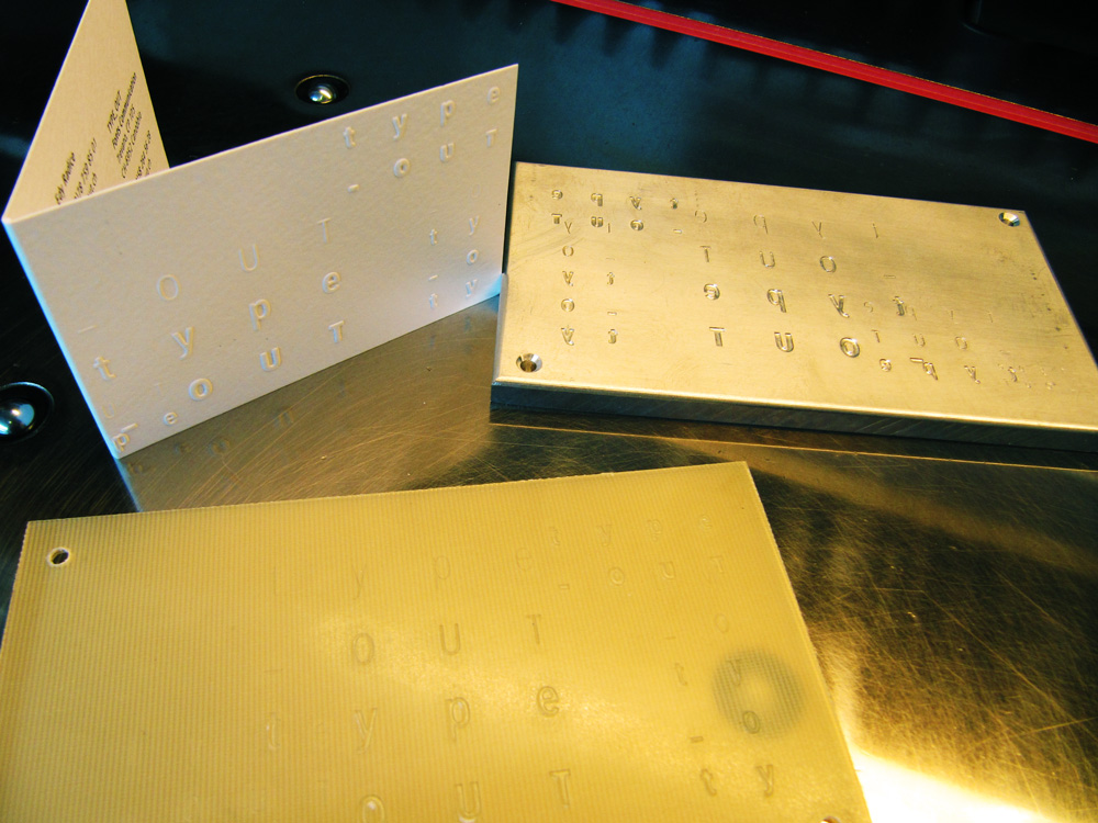
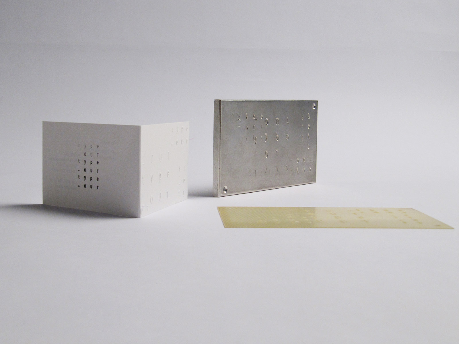
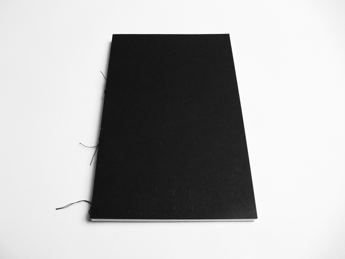
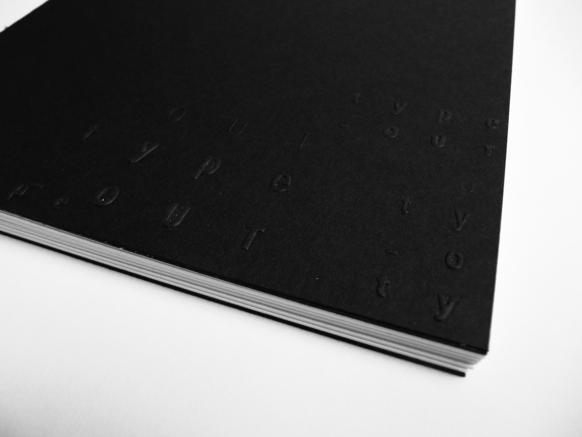
I wanted the logotype to represent the basic traits, but I also wanted to have the "romantic" perceptual feeling of the embossed paper.
After some research on how to recreate the letterpress feeling I've been comparing different paper embossing techniques, and after consulting a printing facility, I decided to emphasize the sensorial and tridimensional feeling by embedding a blind emboss in the different identity elements, which required the creation of a clichée (essentially a metal die) in order to transfer a subject on the paper.
I also decided to avoid inking the embossed part (which is called registered emboss) in order to have an even more "heritage" appeal.